McKenzie’s Country Farm Honey has been on supermarket shelves for over 30 years. The brand is trusted by its customers, but they wanted to rejuvenate their packaging to stand out in the honey aisle. They approached us about the creation of a bold new design for their product line. McKenzie’s wanted to make a statement among the many generic designs of the honey industry. Honey is a staple good, and McKenzie’s produces a differentiated, artisanal product. We wanted our design to reflect this unique status on the shelf, and in the industry.
What We Delivered:
- Packaging
- Graphic Design
- Brand Story
- Branding
- Logo Design
- Website
The Challenge
Since McKenzie’s has an established and loyal customer base, it was important to them that our new design honoured their past branding and logo. We had to retain at least the essence of the look to retain brand awareness among their current customers. However, modernizing the design, to stand out and raise awareness of McKenzie’s among potential new customers, was also important.
There was another issue that had to be addressed. Many of McKenzie’s competitors had very similar designs and bottles. Since people have a distinct idea about what honey should look like, we had to make sure that our design didn’t stray too far from the norm. If it did, people might not even acknowledge the fact that it is honey.
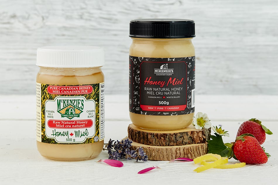
The original jar that’s been on store shelves for 30 years, and the new elegant and modern design on the right.
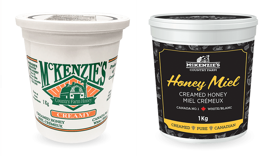
The original McKenzie’s Country Farm Honey 1Kg tub Creamed Honey and the new design on the right.
We came to KIMBO looking to revitalize our packaging, while keeping the brand identity that our customers trust. The KIMBO team produced a bold and clean new look for our full product range, as well as a microsite and a product handout. Their work brought the McKenzie’s look to the forefront of our industry, while retaining a nod to our storied past. KIMBO provided all the customer service we could have asked for from an agency partner.
Rick Belt
Chief Operating Officer, Golden Acres Honey
The Strategy
Our strategy for this packaging project was to create a consistent design for the four items on their product line. We used vibrant colour blocking accents to distinguish each product. The idea behind this strategy was to develop a unified McKenzie’s identity. People would be more likely to buy several McKenzie’s products this way. Our bold colours would draw eyes to the products. Using bright colours in this way was part of our strategy for ensuring people recognized McKenzie’s as honey, by naturally drawing their eyes to our design. We also incorporated an updated/modernized version of the McKenzie’s logo, along with some artisanal, rustic-style illustration as background. This helped link the new branding with the old.
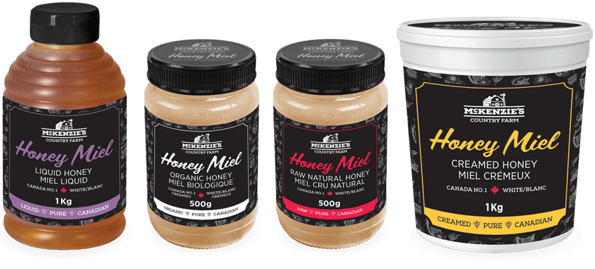
McKenzie’s Country Farm Honey range features bold colour blocking for quick and easy product recognition of the shelf.
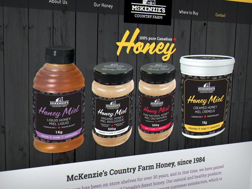
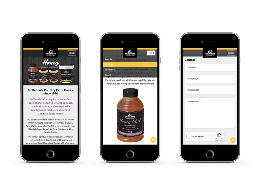
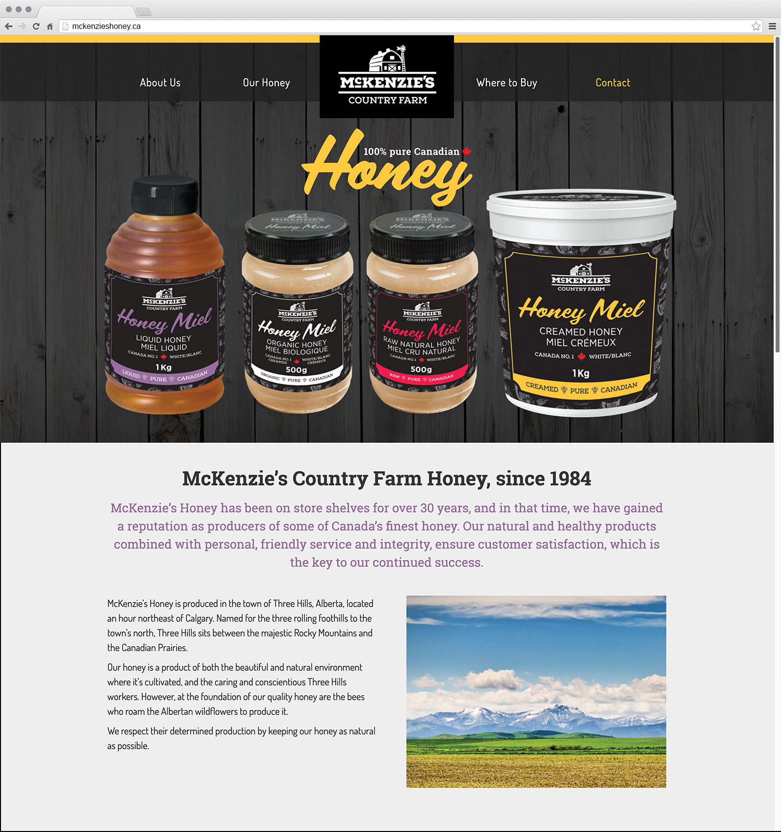
We also designed and built a one-page website to complement the sales sheet print collateral we created as a sales tool for the McKenzie’s line to reach their goal of national distribution.
Results
With a crisp, familiar background for the bright palette we chose, our McKenzie’s Country Farm Honey packaging project was a great success. Our design provided our client with a unique aesthetic for their industry. It distinguishes them from their competitors, while also retaining a connection to their existing brand. The McKenzie’s team appreciated our cooperation throughout the project and was ecstatic at the finished product.