Fisheries and Oceans Canada (DFO) approached KIMBO Design to strip down the design of their current newsletter and breathe new life into it with a more organized and visually striking approach that better reflects who they are and what they stand for. Specifically for the DFO’s Multi-Partner Research Initiative. This newsletter was designed to be a flexible template for both an English and French version to ensure that both of Canada’s national languages are accommodated.
Branding, Print
Fisheries and Oceans Canada
What We Delivered:
- Print Newsletter Template
- Document Design & Layout
The Strategy
Fisheries and Oceans Canada wanted to create something that captured their users’ interest with a more open design. Concerns were raised at the beginning of the project that the way the text was previously laid out was overwhelming and not particularly inviting for its readers. Therefore, the challenge of this project was creating a design that worked in a large amount of content while remaining organized, visually appealing, and didn’t overwhelm the user at first glance.
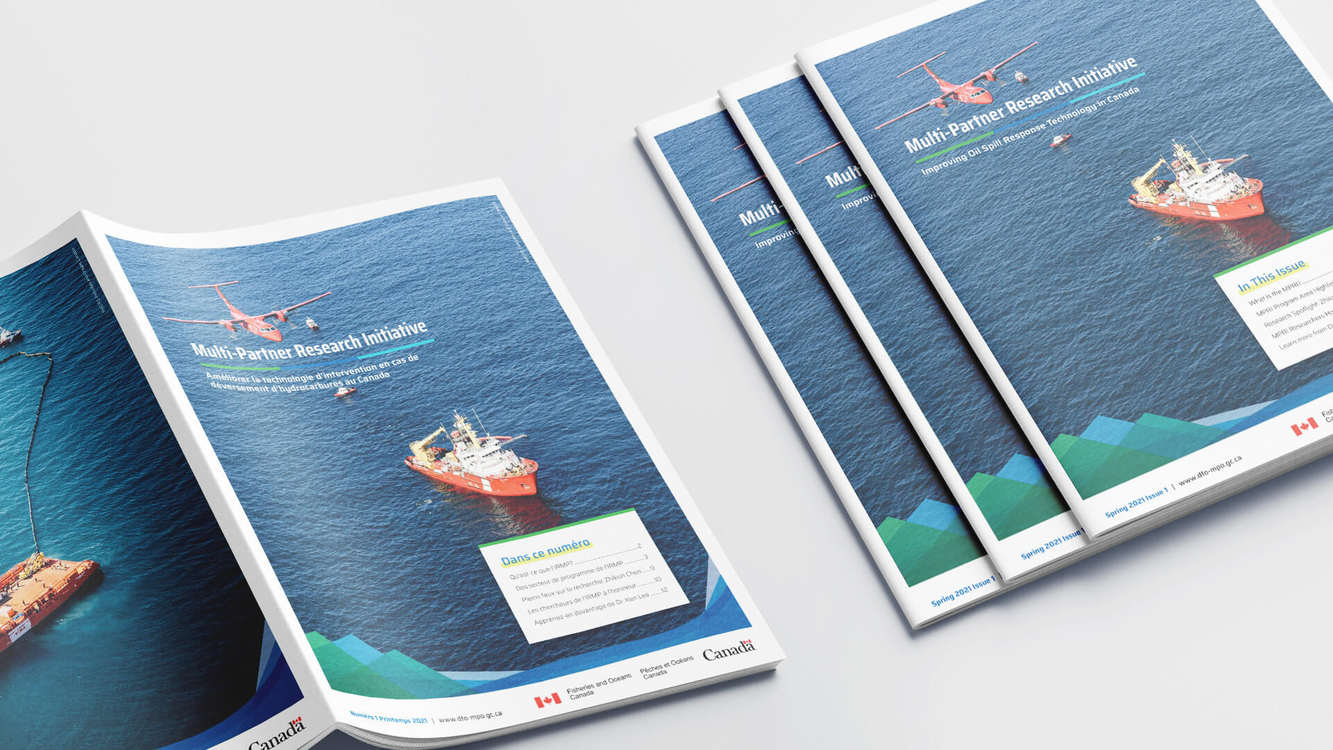
Bilingual newsletter covers.
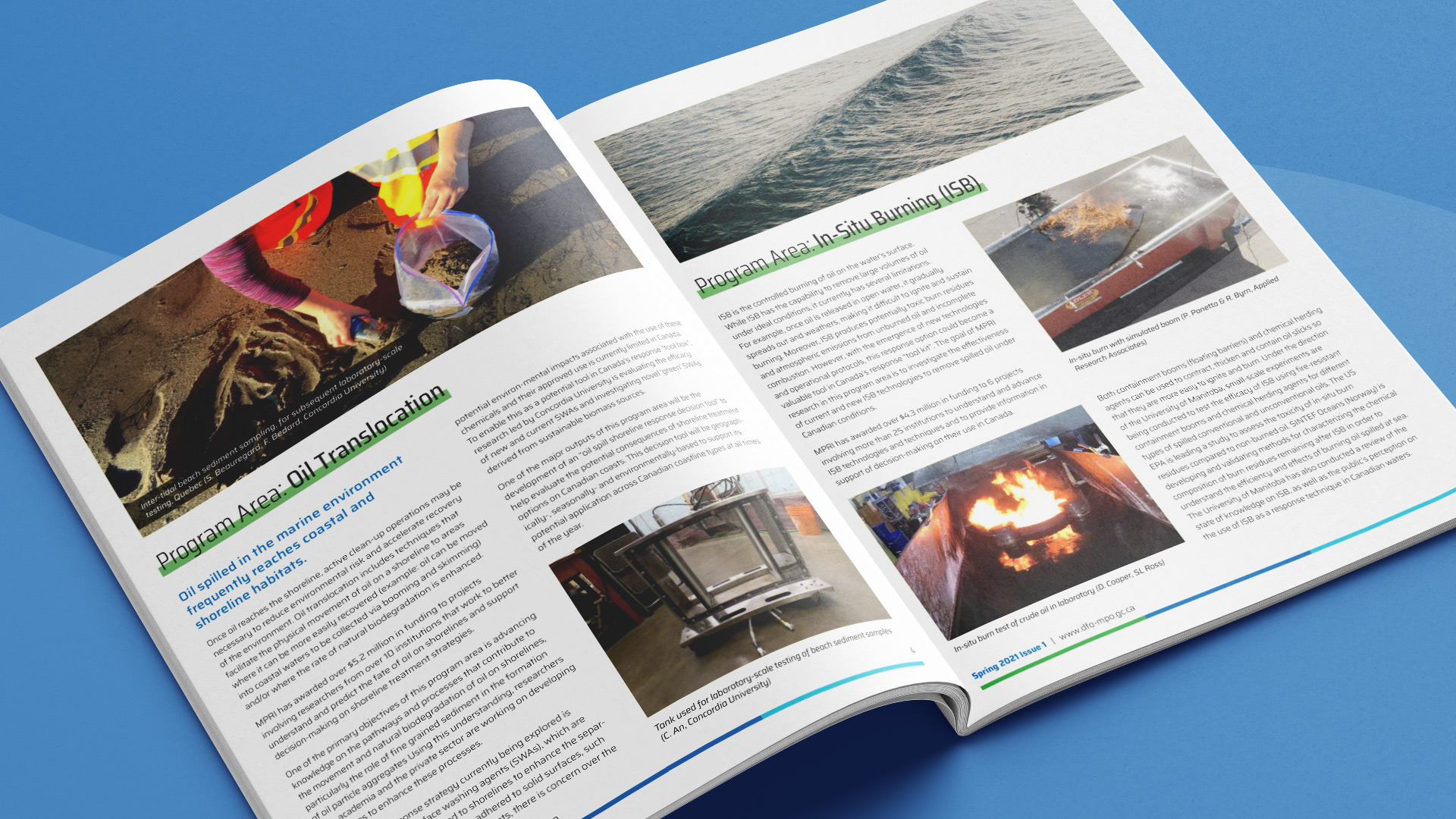
English inside newsletter spread.
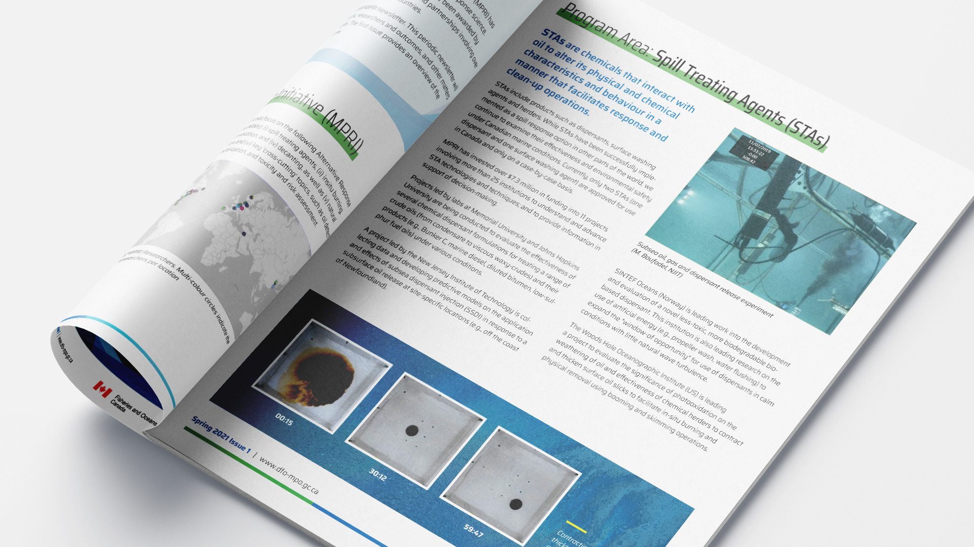
English inside newsletter spread.
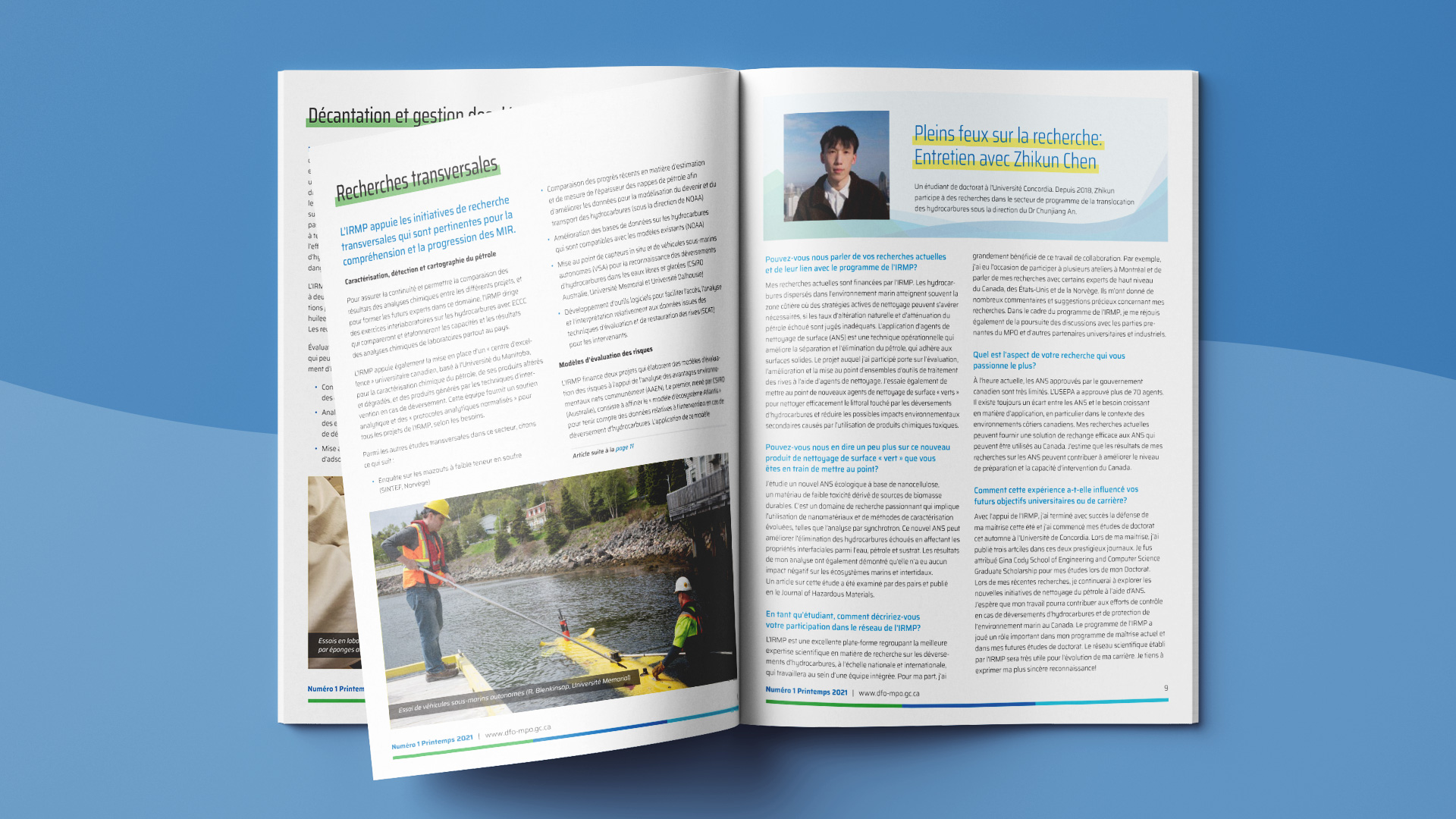
French inside newsletter spread.
Results
The result was that we were able to achieve a clean and organized final template for Fisheries and Oceans Canada to use for future newsletters. We turned over a print-ready version of their current newsletter in English, French and a template for future newsletter updates.