It’s natural to feel attached to your company or organization’s logo. Your logo preserves all the work and effort you’ve put into your business. It also represents the connection you have with your customers and clients. In this way, your logo unites all of the interactions and professional successes that have been achieved. However, logo designs grow old. They become less effective as they are used in new mediums that they weren’t designed for. This is when it becomes time for a logo redesign. A logo redesign is obviously a difficult and delicate process, because you don’t want to lose the reputation built up under the current logo. Here at KIMBO, we take several key steps into consideration when working with a client on a logo redesign.

Logo Redesign Versatility
A modern logo must be flexible. Whether it’s being used horizontal, stacked, online, offline, in colour, black and white, as an icon, or with text, your logo must retain its integrity with the public, which can be accomplished by remaining faithful to logo use guidelines. We provide these to our clients, so they simply consult the guidelines whenever they are unsure of how to use it. We also consider versatility in logo redesign during our creative process. Every logo design we create is done so in black and white to begin with, so the design can be judged on its own merit, and the client’s attention isn’t influenced by colour. Once the client is happy with the design, we brainstorm the colour palette. By building the logo from the ground up, we ensure usage considerations for all platforms are built into the final product.

Logo Redesign for Digital Use
Another component that must be considered in a logo redesign is the new technologies/channels that it will be used on. New social media platforms and apps are popping up all the time. It’s important to use foresight with a logo redesign. The way that we accomplish this in our logo redesign process is to minimize complexity in our work. While a complicated and intricate logo may be the best way for us to show off our artistic chops, it hinders our client’s ability to connect with the public. Complex images don’t work well online, especially on the small screens of our phones. This is the reason digital leaders like Facebook, Google, Twitter, and Amazon have designed simple logos that easily translate across different platforms. We echo this sentiment when doing a logo redesign, to ensure brands are future-friendly.
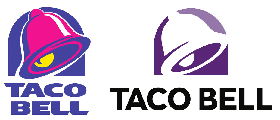
Brand Identity Retention
The biggest concern for a logo redesign is ensuring your current customers can recognize the new logo. Having built up a brand reputation, you don’t want to jeopardize this reputation when changing your logo. This is even a concern for massive corporations. In the last 18 months, both Subway and Taco Bell have released new logos, undergoing all of the same concerns as even the smallest family business. Common to both logo redesigns are simplicity and retention of brand identity. Paul Rand, the vaunted designer of iconic logos for IBM, UPS, and ABC, advocated for logos that were distilled down to their essential elements. Both the Subway and Taco Bell redesigns follow this philosophy, evolving towards Rand’s ideal. Achieving this can be more difficult for smaller, local brands, but that doesn’t mean the process must change. KIMBO puts an emphasis on isolating the crucial elements of your logo, so that the logo redesign doesn’t spook your existing customers. We accomplished just this on our recent McKenzie’s Honey Packaging Redesign, which can be viewed and read here.
![]()
