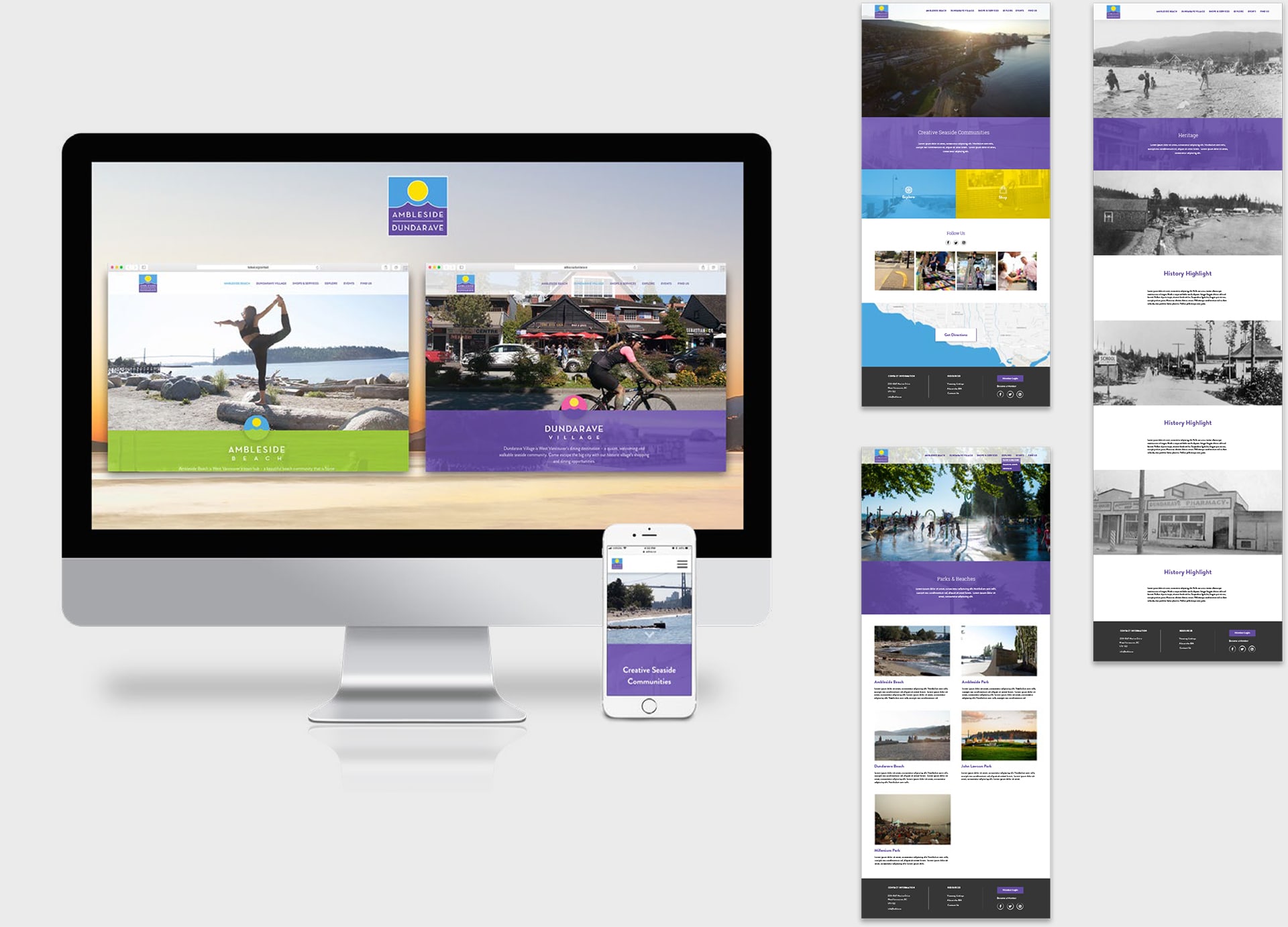
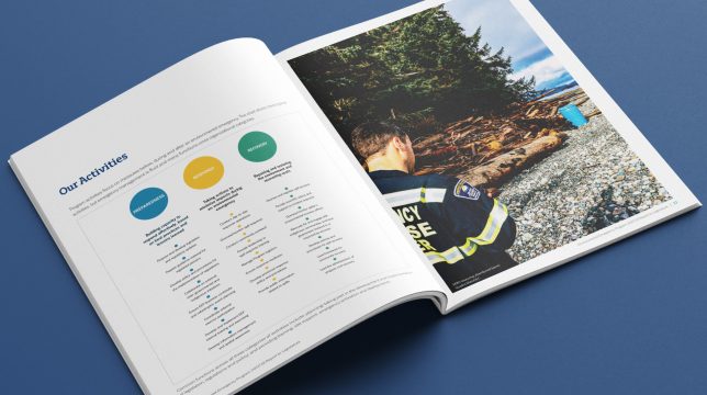
Since community involvement and perceptions testing were so important for creating a realistic brand identity for the ADBIA, we undertook two rounds of focus group testing, to figure out how the public viewed Ambleside-Dundarave in the context of Metro Vancouver. The first round of testing involved gathering as much consumer input as we could regarding the current view of Ambleside-Dundarave by locals and those from surrounding areas. With one group of North Shore residents, and another made up of those living outside West/North Vancouver, we learned about their shopping habits, what factors influence them to visit new places, and their perceptions of the Ambleside-Dundarave area.

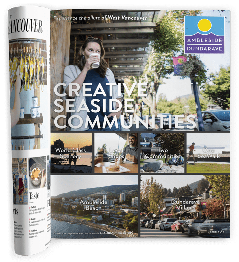
ADBIA full-page magazine ad.
After analyzing the data collected from the first round of focus groups, we began developing the brand identity. Once several creative concepts and messaging approaches were developed, we undertook a second round of focus group testing, to see which direction we had created accurately represented people’s feelings about the area. Using the results from the second round of research, we finalized our logo and brand direction.

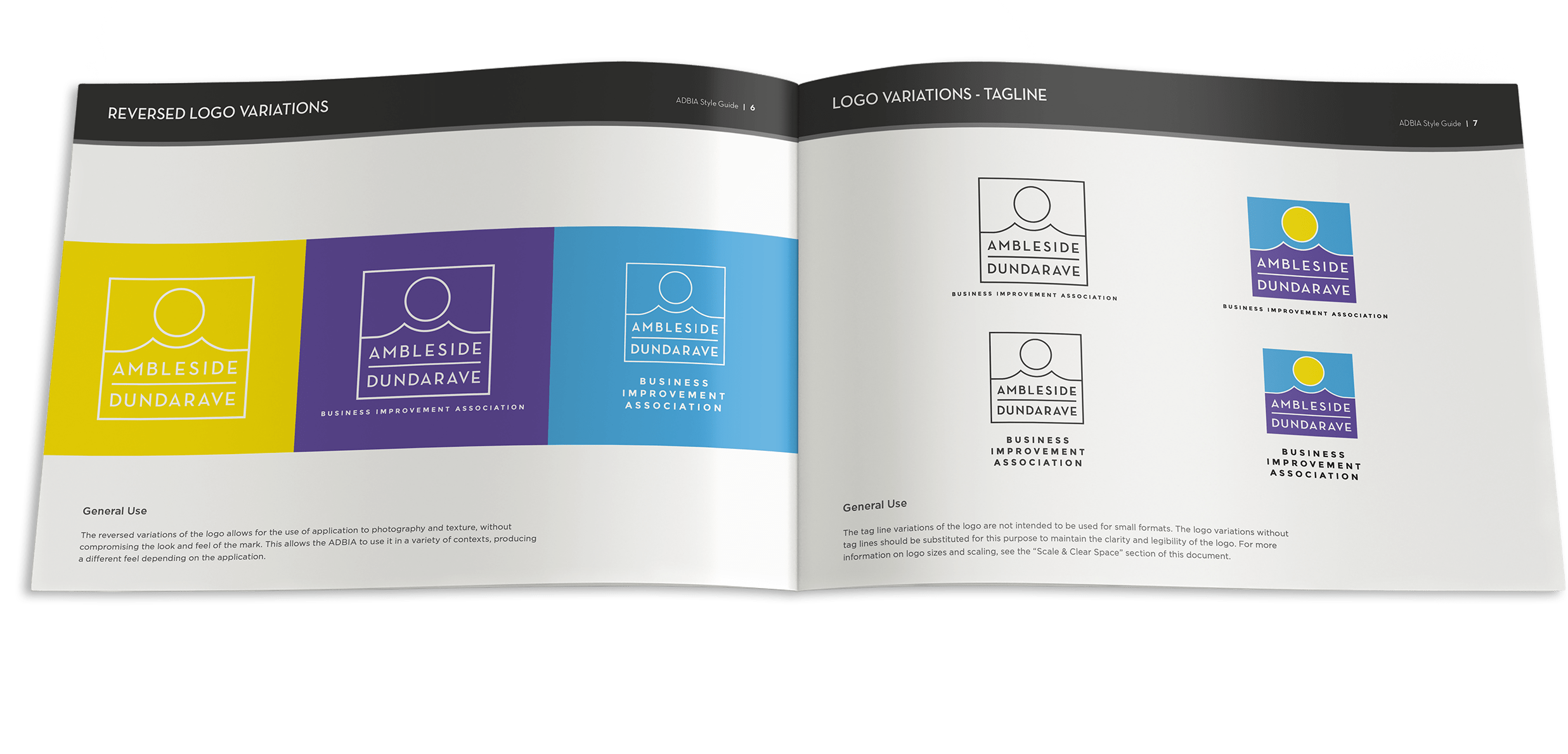
ADBIA Style Guide colours and usage.
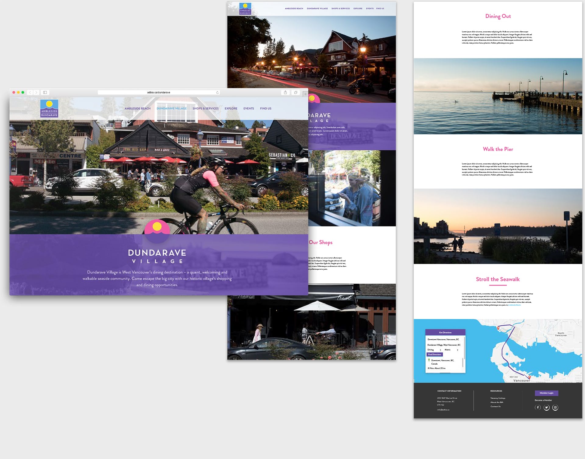
Our approach was a simple logo design, with the idea that it could be applied in many different contexts, always giving viewers a fresh perspective on it. The main ADBIA logo reflects the natural beauty of the area, using bright colour blocks. We also used distinctive colour palettes in order to differentiate between Ambleside Beach and Dundarave Village, the neighbourhood sub-brands we created, in order to ensure that both areas were fairly represented under the brand.

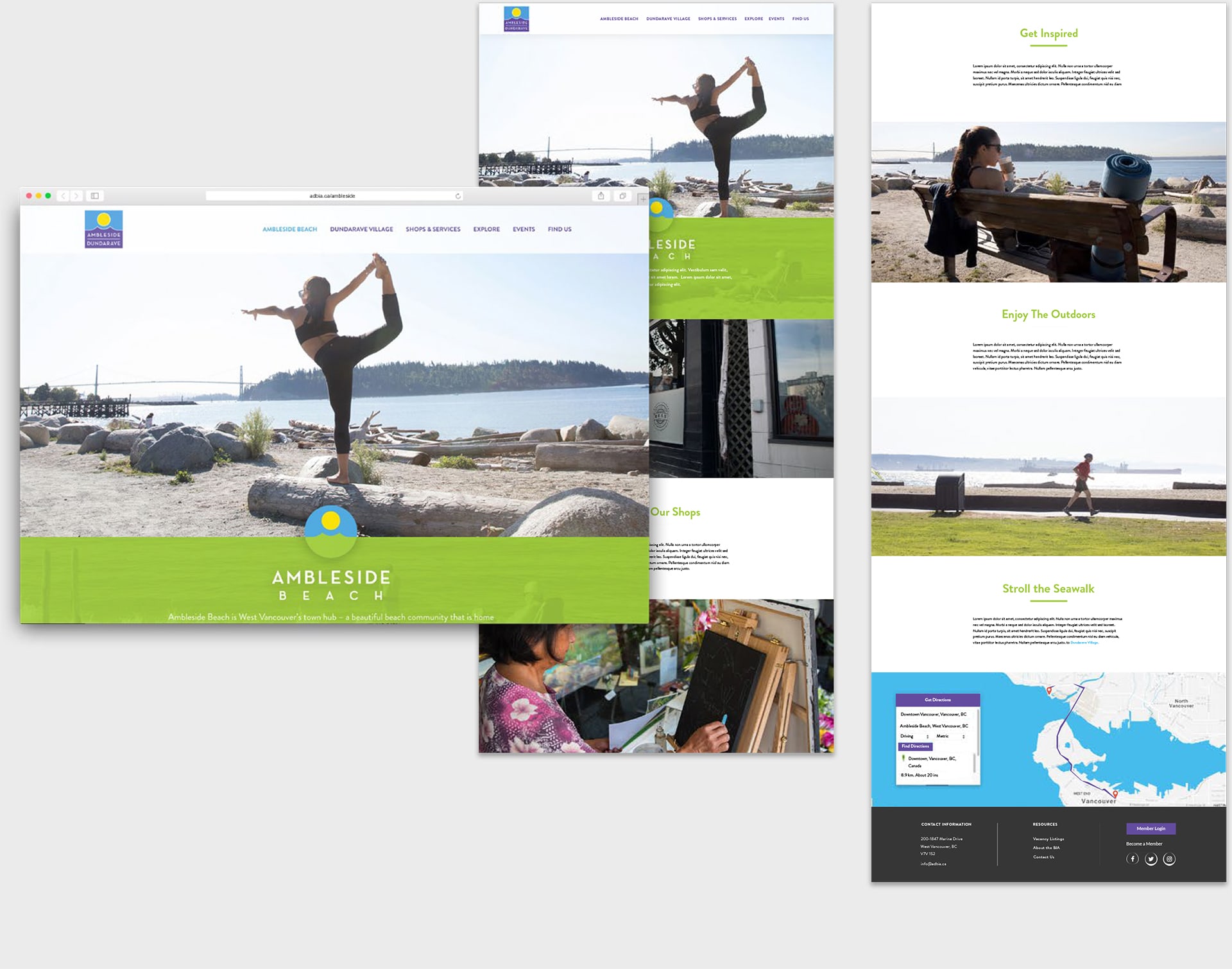
Ambleside Beach Page on the ADBIA Website

Dundarave Village Page on the ADBIA Website


