It is no secret that since the introduction of the world wide web, modern audiences have developed an increasingly shorter attention span for information and resources they come across. In the rapidly moving world of the internet, individuals receive more and more information with significantly less time to review each piece, and the phenomenon has become even more apparent since the mainstream adoption of smartphones.
With the sheer amount of resources available to us at our fingertips, an average individual could easily come across hundreds of different articles each overflowing with information every day. This makes it increasingly difficult to capture the attention of the modern audience and keep them enticed with traditional web and document design approaches.
This is where data visualization comes in. First impressions matter. You don’t want your audience to lose interest in your work at first sight.
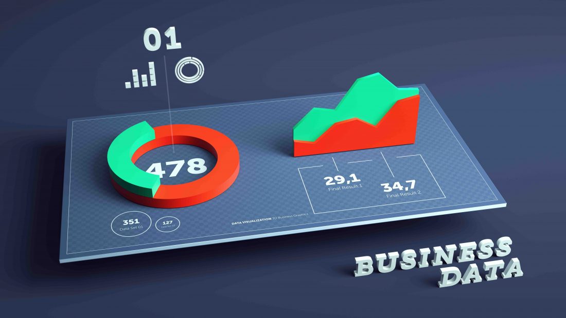
An ongoing trend in modern web and document design is a gradual increase in the utilization of infographics and other data visualization solutions in place of text and numbers.
Most commonly used to help create a compelling narrative and to present essential information/data in a visually engaging manner, infographics are especially important in the design of websites and data-heavy documents (e.g. Annual Reports).
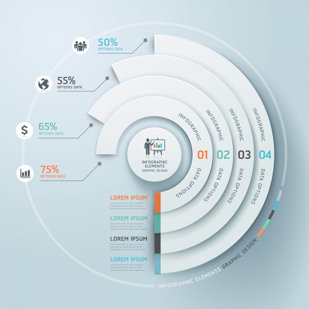
Infographics allow the most vital information of a website or document to be presented front and centre. They help people understand key information derived from the data and can be used to quickly communicate a message, to simplify the presentation of large amounts of data, to see data patterns and relationships, and to monitor changes in variables over time.
This is especially suitable for many public sector entities where large amounts of data often have to be distributed as public knowledge. An great example of this would be Statistics Canada.
Making these resources available in a visually engaging manner also encourages audiences to redistribute/share information on topics they’re interested in through their own social media channels. This expands the audience base and helps capture the attention of the audience (maybe even just for a split second). This allows raw data to almost become sharable PR materials as well, ensuring that the return on investment spent on producing these materials is maximized.
These are just some of the many reasons why infographics have gained momentum in a range of modern design. For more information on how data visualization could help you, please feel free to get in touch or check out our case studies.
