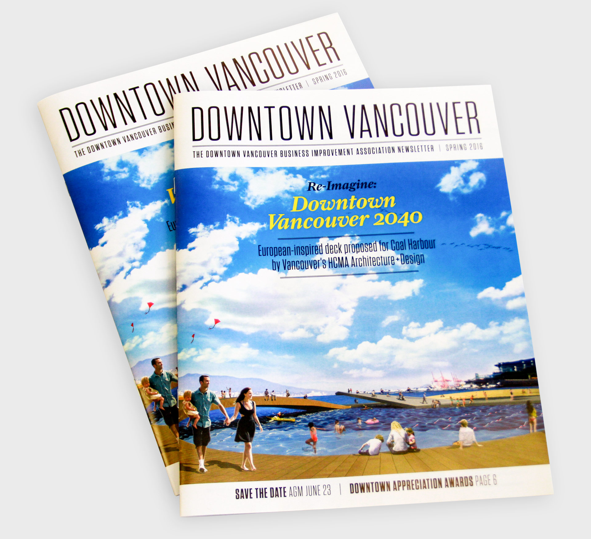
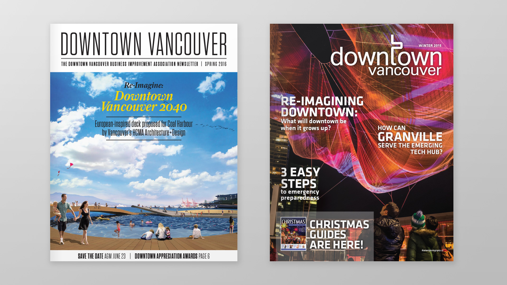
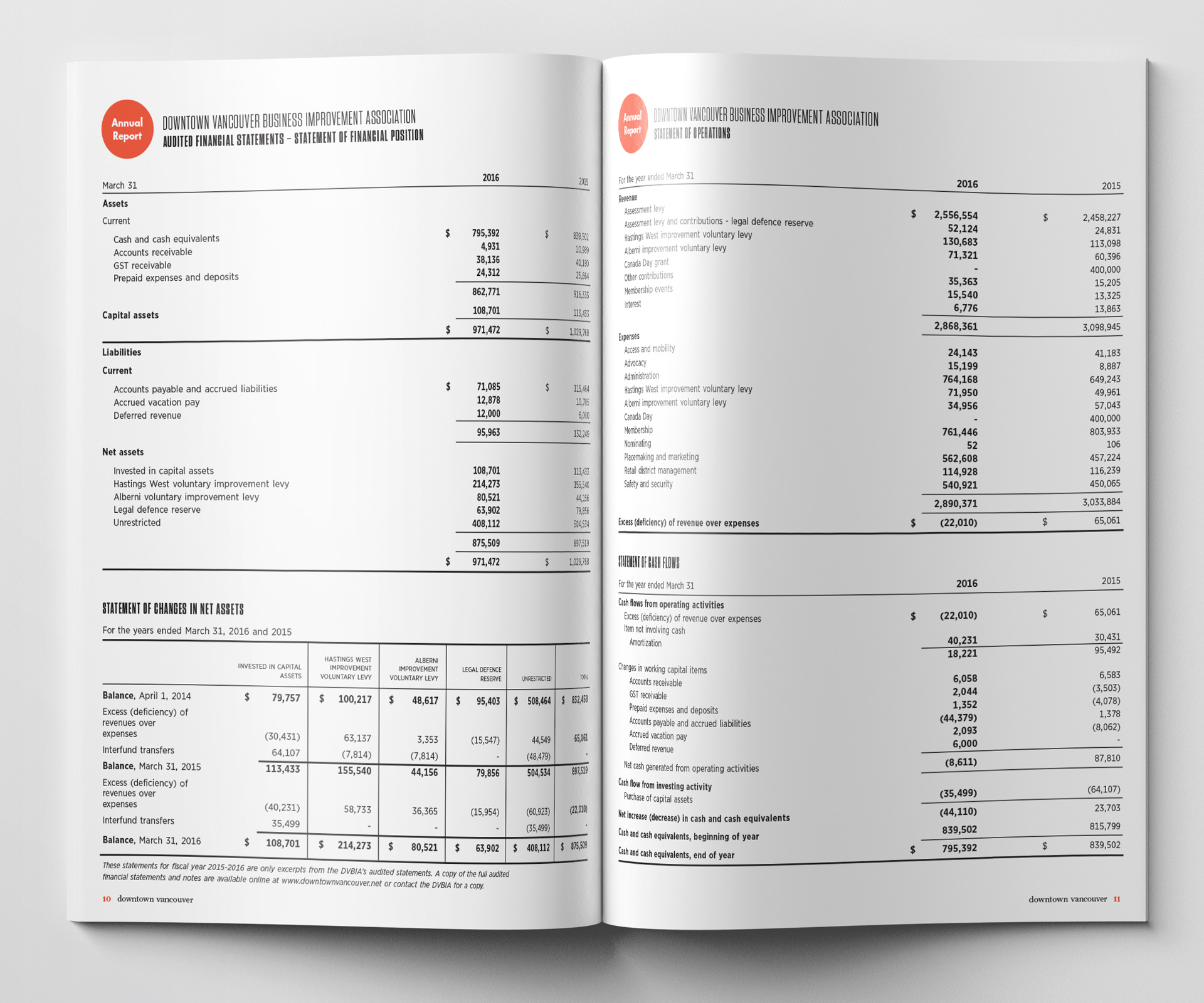
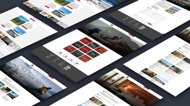
The Downtown Vancouver Business Improvement Association (DVBIA) came to us about revamping their annual report/newsletter. The DVBIA works to serve the collective interests of its member businesses, engaging in activities such as communications, sponsorship acquisition, ensuring cleanliness, and crime prevention, which helps to facilitate commercial success in Vancouver’s downtown core. This document relays information about business success in the downtown core, profiles local retailers and entrepreneurs, provides DVBIA financials, and includes articles about future invigoration possibilities for the area. They expected us to provide a modern and elegant design for the magazine’s editions from 2016 to 2023 and for future issues to follow.
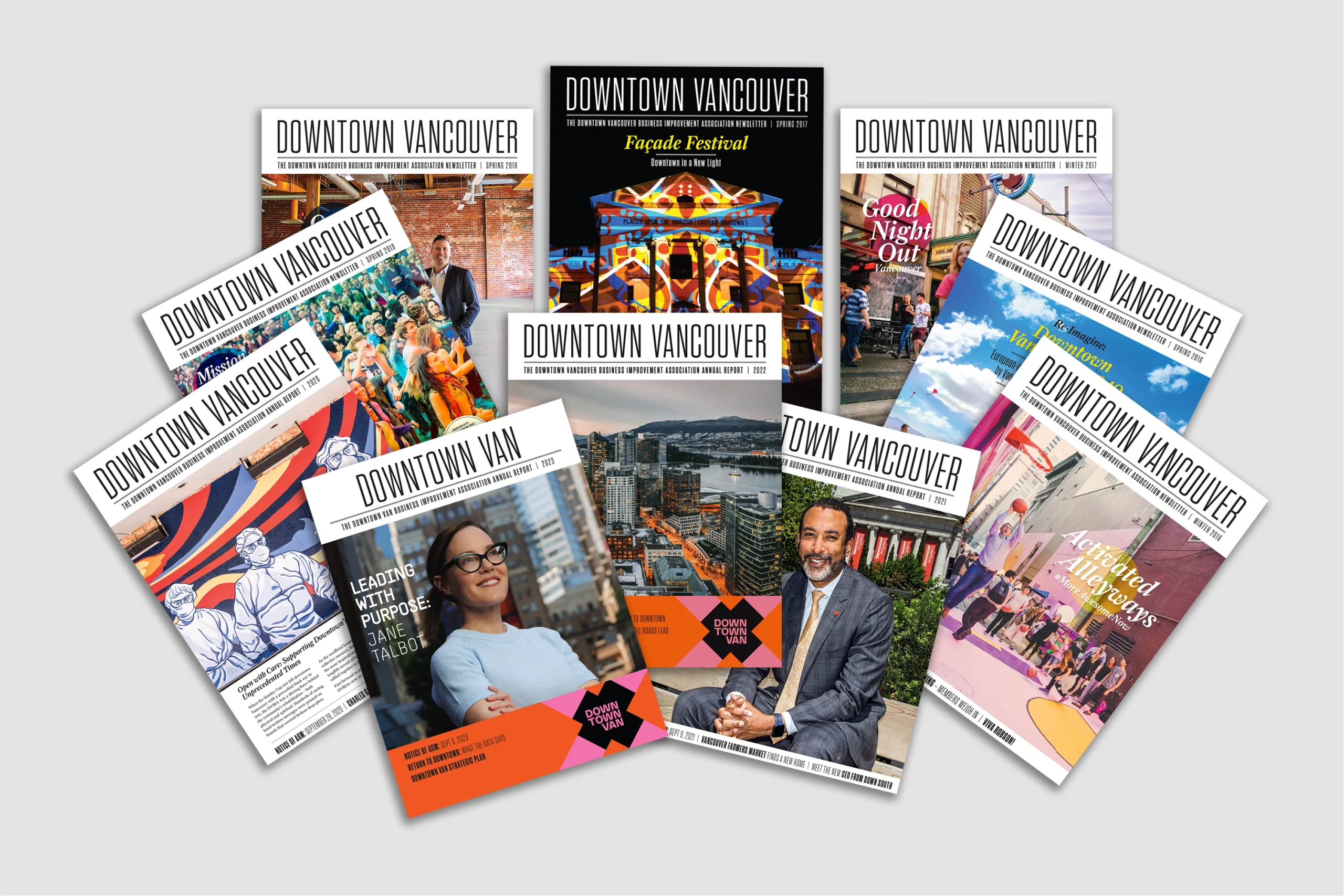
DVBIA annual report/newsletter from 2016 to 2023