Accessible PDFs: The Catch-All Key
Creating an accessible pdf may seem challenging, but it is a vital step in audience engagement. Most people have no problem reading PDFs. They are also better for the environment. Portable word documents allow us to save paper and communicate on the fly with anybody around the world.
Need to distribute a report to remote areas? No issue.
Need to collaborate on one document? PDFs are at your disposal.
But here’s the thing, if PDFs are your content currency, then disability is your exchange rate.
No information is received equally on the ability spectrum. If you want to engage everybody, you need to make your work accessible.
Many people have disabilities which inhibit them from quickly scanning texts or scrolling through a website. According to World Health Organization, “at least 2.2 billion people have near or distance vision impairment.” FYI, that’s 27% of the world’s population.
Not all impairments are the results of accidents or disease either — sometimes it’s just a part of growing old. We are all equal in losing our ability to read with time, just as we are in our need to use computers.
If you work in public service, it’s crucial you invest in accessible pdf design. UX goes way beyond information architecture. Say you coordinate services for geriatric patients (65 years and older). Our eyesight can starts to degrade after age 50. That means many, if not all of your users could have impaired vision.
Let’s go a little deeper. You’ve redesigned your website to include key health resources. Your long-term goal: reduce the number of walk-ins at emergency rooms. You’ve filled your website with detailed PDFs about the common cold, typical geriatric conditions, and lists of specialists and walk-in clinics in the region. If your website and the PDFs stored there don’t facilitate the Read Out Loud function, or magnification of the text, your users won’t access the tools and you’ll end up with the revolving door problem you were so desperate to avoid.
A PDF is adjusted from being non-compliant to optimized.
Tag, tag, tag: Solutions for the Digital World
Okay, but any PDF can be read aloud by a screen reader. Isn’t accessibility already in the bag?
Yes, and no. Digital data — the kind on your PDFs — is dense and vast. We need systems to sift through the data to draw fast, effective conclusions. For your users, this could be which specialist to consult or symptoms to look out for and rule out anything serious.
We’re lucky that today we have tools like Adobe’s Read Out Loud function, to help people with limited vision scroll through a PDF.
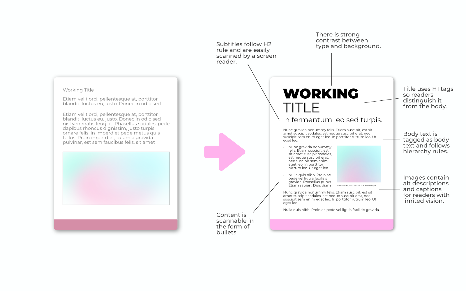
This technology has come a long way, but it relies on document formatting to read documents in order you intended. Like web pages, an accessible PDF is organized through tagging. H1s are for headers, p tags are for bodies of text, but that’s just on the surface.
Any graphics should have alt text and be labelled as Figures, otherwise they’re considered aesthetic. You have to imagine the end-goal: where do I want my users to end up?
We do this all the time for websites, but the same tactic applies to PDFs. On the flip-side engaging in this meticulous process will pay off. In fact, applying this strategy to your websites will also improve SEO ranking 📈 — more on this in our next blog.
Make Your Trademark Accessible
For some, the process of accessible design may seem tedious and if you are a crown corporation, you probably have hundreds of PDFs to update and reorganize. Still, you can’t be compliant if your resources aren’t accessible.
One form of compliance is colour contrast. Like text reading, colour contrast helps readers with reduced vision distinguish foreground from background. Any information you curate to readers should be filtered through a contrast checker with the exception of black text on a white background or black on white.
For instance, Nike meets this standard automatically with white swoosh on black and inverse upon entering their website.
It may be disappointing to limit colour palettes to black and white, yellow and blue, but colour blindness affects a significant number of people. For instance, did you know that 1 in 12 men are colour blind? Varieties of colour blindness such as deuteranopia prevent viewers from seeing the “redness” in purple, so it appears blue, while magenta appears grey.
If you want to get your brand off the ground, design for everyone. At KIMBO, we follow strict guidelines to ensure our materials are not only compliant, but accessible to a wide range of readers and viewers. Our designers work with colour palettes that stand not only the test of time, but the entire spectrum of vision.
Check out our client web page and learn how KIMBO can rework your brand strategy and make it accessible to any age or ability group.
