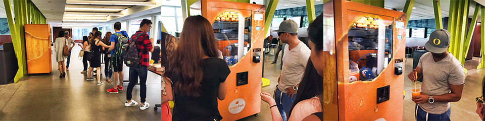
With the growing popularity of freshly squeezed juice, OrangeFresh has entered the market tempting customers with a unique way to get a burst of vitamin C. OrangeFresh’s attention-grabbing vending machine targets health-conscious customers who want a fast and easy pick-me-up. The machine has a see-thru window, which allows customer to see the inner workings of the juicer, where cutters and cogs squeeze oranges right before their eyes.
Branding, Packaging, Print, Web Design
OrangeFresh
What We Delivered:
- Logo Design & Branding
- Vending Machine Wrap
- Digital Advertising
- Social Media Strategy
- Parallax Website
- Print Advertising
- Stickers
- Point-of-Purchase (POP)
The Challenge:
Since OrangeFresh had a short timeline to get their vending machine to market, it was urgent for them to quickly establish their brand and visual identity. They were looking for a clean, minimal, and uniquely recognizable creative. OrangeFresh’s design solution required a flexible approach that could be applied to all elements and applications.
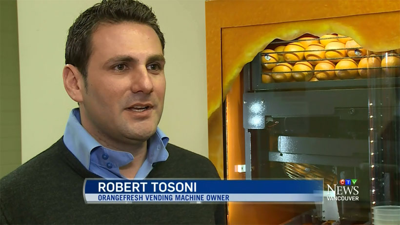
Working with KIMBO Design has been amazing. Right from the start, when we discussed our needs, they were prompt and responsive under very tight deadlines. They listened to what we wanted and delivered high quality creative work on time. They are also very flexible on short notice projects. We love how our new brand is generating high volume sales. Thank you KIMBO for all your hard work!

Robert Tosoni
Founder and President, OrangeFresh
The Strategy:
To establish the brand identity, the team at KIMBO focused on the uniqueness of OrangeFresh’s vending machine. The identity plays up the novelty of fresh juice coming from the machine, with the logo featuring a cube-shaped orange, complemented by boxy, orange typography. One version of the logo even resembles the stickers found on supermarket fruits.
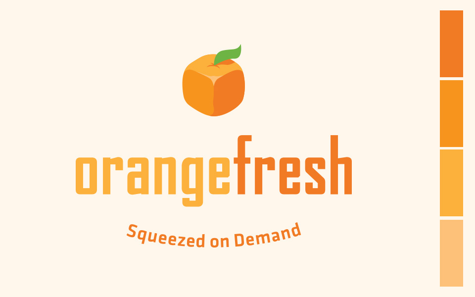
We used a simple colour palette that utilized several shades of orange to connect the colour spectrum of fresh orange juice. For brand extensions, such as the print ads, we paired the orange values with a warm cream tone to reinforce a connection with the fresh and the organic. We also used textural photography of fresh oranges, images of orange skin and flesh, to provoke thirst, and entice customers to purchase a glass of juice.
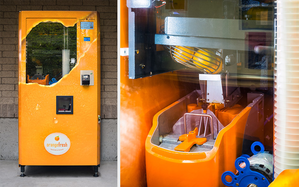
The principal of minimal design was evident in every aspect of the brand extensions. To emphasize fresh oranges, our solution was designed with simplicity and understated creative. The vending machine wrap was designed to resemble a giant orange with a torn peel that allows for the viewer window opening. The cup packaging was also designed to be mostly transparent, to make the juice the main focus.
Results
Within a very tight timeline, we were able to deliver creative that enhanced OrangeFresh’s concept. Shortly after the vending machines were unveiled, our design solution garnered media attention on Vancouver’s CTV News.
A venture capitalist recently approached the owner looking to buy into the company because they was so impressed by the concept, brand, and strategy that we established. Demand for the product has been higher than expected, and recently, OrangeFresh has expanded to a second local college campus. They are currently ahead of schedule to deliver more vending machines in British Columbia and throughout Western Canada.
The “Giant Orange Peeling” design project received media attention from Applied Arts.