Ornative Tableware had just recently undertaken a rebranding project, but they were dissatisfied with the results. They came to us in order to set these issues straight, and establish their company on a sturdy branding foundation, with a defined vision. The Ornative decision makers had stressed to us that they wanted to create two distinct brand identities, through which they would appeal to customers in their two primary distribution channels: commercial clients (restaurants, hotels, etc.) and retail stores
Branding, Packaging
Ornative Tableware
What We Delivered:
- Branding
- Packaging Design
- Graphic Design
- Logo Design
The Challenge
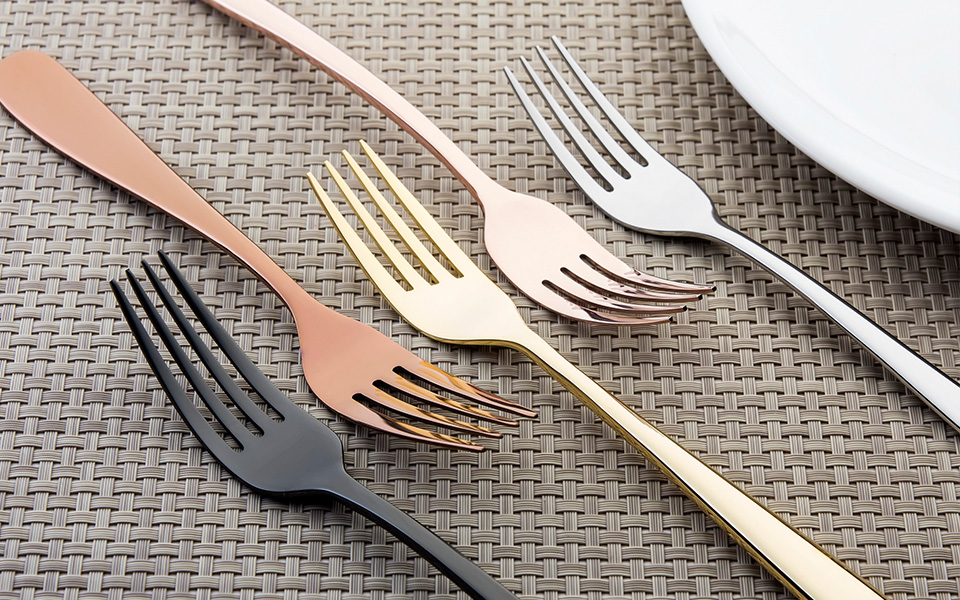
We needed to develop two unique identities to represent both types of business Ornative Tableware deals in, but we also needed both brands to be cohesive enough to develop an overall Ornative Tableware identity. For the commercial brand, they wanted a design that connoted luxury, class and quality, as you would expect at five-star hotels and restaurants. For the consumer-oriented brand, they wanted a design that showed vibrancy, emphasizing the lifestyle opportunities their flatware provided, in terms of both durability and style. Thankfully, Ornative Tableware produces sleek and stylish flatware designs, including options in black, gold, and rose gold. With such an aesthetically pleasing product, our packaging needed to act as the frame to a beautiful painting: complementary and refined.
The Strategy
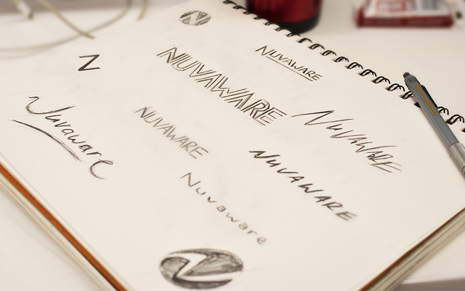
Our first step on this project was to outline names, logos and visions for each of the two brands. For the consumer brand, we wanted something that resonated with younger, modern families, who enjoy entertaining and dinner parties. The name we settled on for this brand was Nuvaware. It reflects the modern, energetic tone that we wanted the brand to take. For the Nuvaware packaging, to complement the tone established by the name, we chose to use very bright colours, along with a dynamic box design. The combination of all of these elements led to a robust and lively package, which displayed Ornative’s best flatware.
![]()
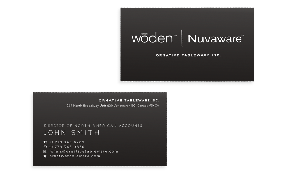
For the commercial brand, we wanted something more subtle and sophisticated. Since this isn’t going to be sold in stores, the brand had to be directed towards restaurant and managers, who are interested in buying flatware to extend their existing brands. The name we came up with for this brand was Woden. Woden is the “supreme god” in Germanic and Norse mythology, and we wanted to utilize this historical to assert this brand as the highest quality flatware, with a slightly mythological aura behind it. By supplementing this name with bold, strong colours, we created a powerful commercial brand, with the luxurious undertones Ornative Tableware desired.
![]()
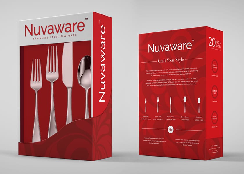
Nuvaware packaging, front and back in red.
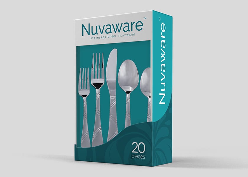
Nuvaware packaging in teal.
Results
With both the Nuvaware and Woden brands, we created a cohesive visual identity for Ornative’s modern flatware, presenting both the two brands and the company itself in a fresh and enticing light. Nuvaware has a splash of bright colour, designed to draw the eyes of consumers to the excellent flatware within. Woden has the sophisticated air required for the extravagant hotels and restaurants that will be purchasing it. Our designs on this project captured the essence of both brands, directing them towards the specific markets they’re aimed at.