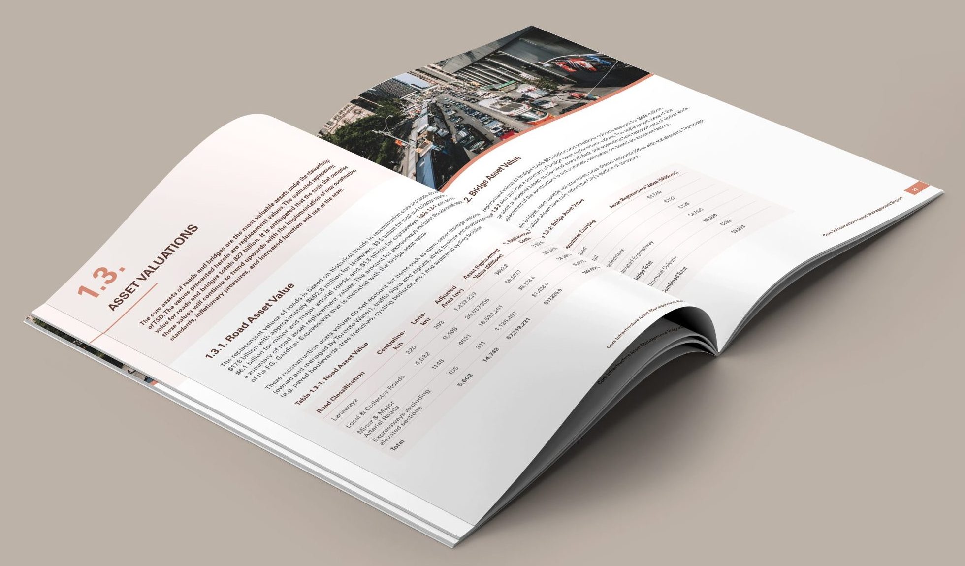
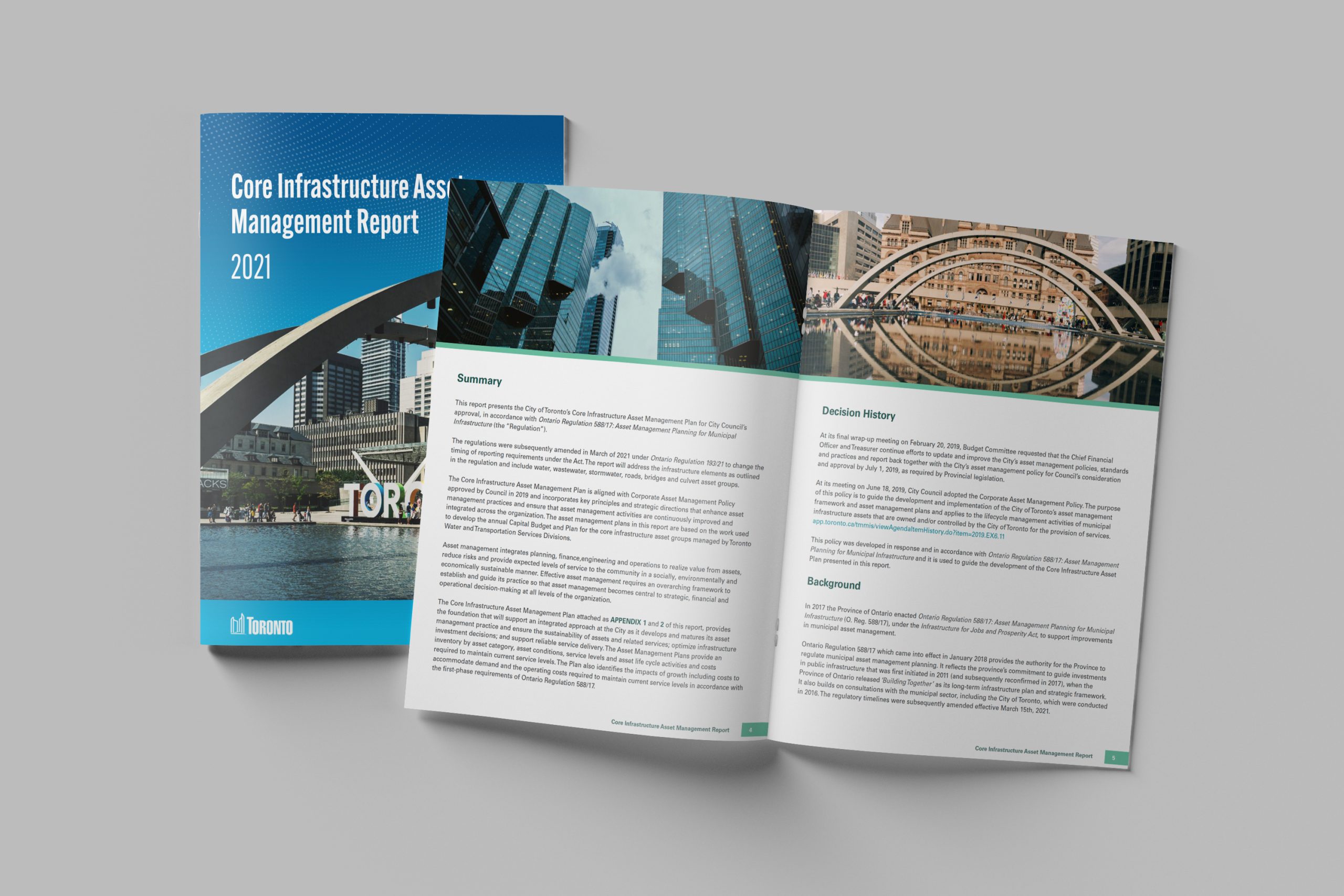
The City of Toronto approached KIMBO Design to help with the redesign of their 2021 Annual Report and breathe new life with a more organized and visually striking approach. The Annual Report is a combination of information from three divisions that is two hundred and six pages long. KIMBO Design took a clean and modern approach, using a minimal colour palette and clean typography to create a sleek and sophisticated design.
Related Case Studies:


 The City of Toronto wanted to develop a design that would pique the interest of its readers with a more inviting aesthetic. Early in the project, concerns were raised that the text was too chaotic and uninviting for readers. Thus, this project aimed to create a design that worked with a high volume of text while remaining organized, and visually appealing.
 Our strategy was to adhere to city branding standards and maintain coherency throughout the design. To start the project, we reviewed the City of Toronto’s current template for its annual reports and then identified areas where the template could be streamlined to be more reader friendly. We then created a revised template, incorporating input from all stakeholders. The revised template was tested and refined and is now in the process of being implemented. As a result, the City of Toronto now has a more efficient and effective design for its annual reports. This will ultimately save time and resources, resulting in better decision-making by city officials.


