KIMBO was commissioned by the Industry Training Authority (ITA) of British Columbia to develop a full brand identity for the ITA Indigenous Initiatives as well as the respective branded materials and marketing collateral. Services provided include graphic design, creative conceptualization, copywriting, and brand implementation guide development among others.
Branding, Packaging, Print
ITA Indigenous Initiatives
What We Delivered:
- Graphic Design & Creative Direction
- Marketing Collateral (incl. PPT Design)
- Brand Style & Implementation Guidelines
- Background Research
- Copywriting
The Challenge:
Brand materials designed and developed by KIMBO consists of a pop up banner, Indigenous Inclusion Strategy (document design & layout), branded presentation folders, bookmarks, PowerPoint Presentation template, and handout materials. KIMBO conducted substantial research and worked closely with ITA staff members on this project to ensure that all the relevant parties and cultures are properly represented while remaining aligned with project goals and governmental procedures. The initial concept of the brand logo was developed by West Vancouver artist Alano Edzerza, who is a member of the Tahltan Nations and further refined by KIMBO. We remained vigilant in this project to honour the initial creative directions in place and to authentically incorporate it into the brand identity of the ITA.
One of the main challenges of the project was to ensure that our creative concepts remain aligned with the brand of the ITA and represents Indigenous culture authentically. To gain a more broader sense on where the initiative stands, the ITA constructed a total of three surveys for ITA staff, employers/ sponsors, and Indigenous apprentices to gather different perspectives on the matter. This helped us establish a better view of what the look and feel of the end product shall be. The common insight gathered was the need to incorporate Indigenous world views, culture, knowledge and traditional practices into the brand. With this, we proceed to draft the design concept.
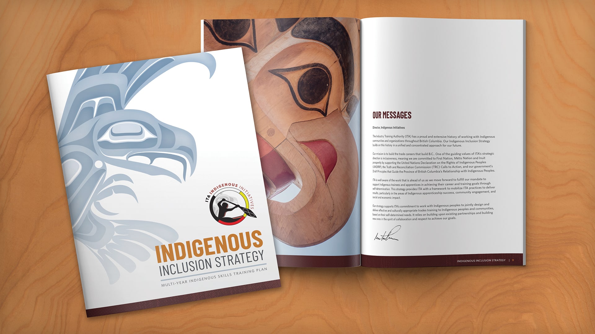
Our document design and layout for the Indigenous Inclusion Strategy was a central part to the ITA Indigenous Initiative project that clearly demonstrates our Indigenous artwork inspired designs.
The Strategy:
Our strategy was to create a unique brand to represent the proud and extensive history of working with the Indigenous communities and organizations throughout British Columbia. The new logo was designed with the intent to ensure that it was representative of the various First Nations Communities across the province. To do this we incorporated the medicine wheel to represents exclusivity and also the Metis infinity symbol to symbolize collaborative effects. The ultimate objective is to increase Indigenous opportunities and participation in trades across the province through creating a sense of commitment and a thoughtful and prideful identity. The photographs used complement the ITA brand colours and were selected to reflect the diversity and differences between the various First Nations communities.

Industry Training Authority – Indigenous Initiatives card and envelope.
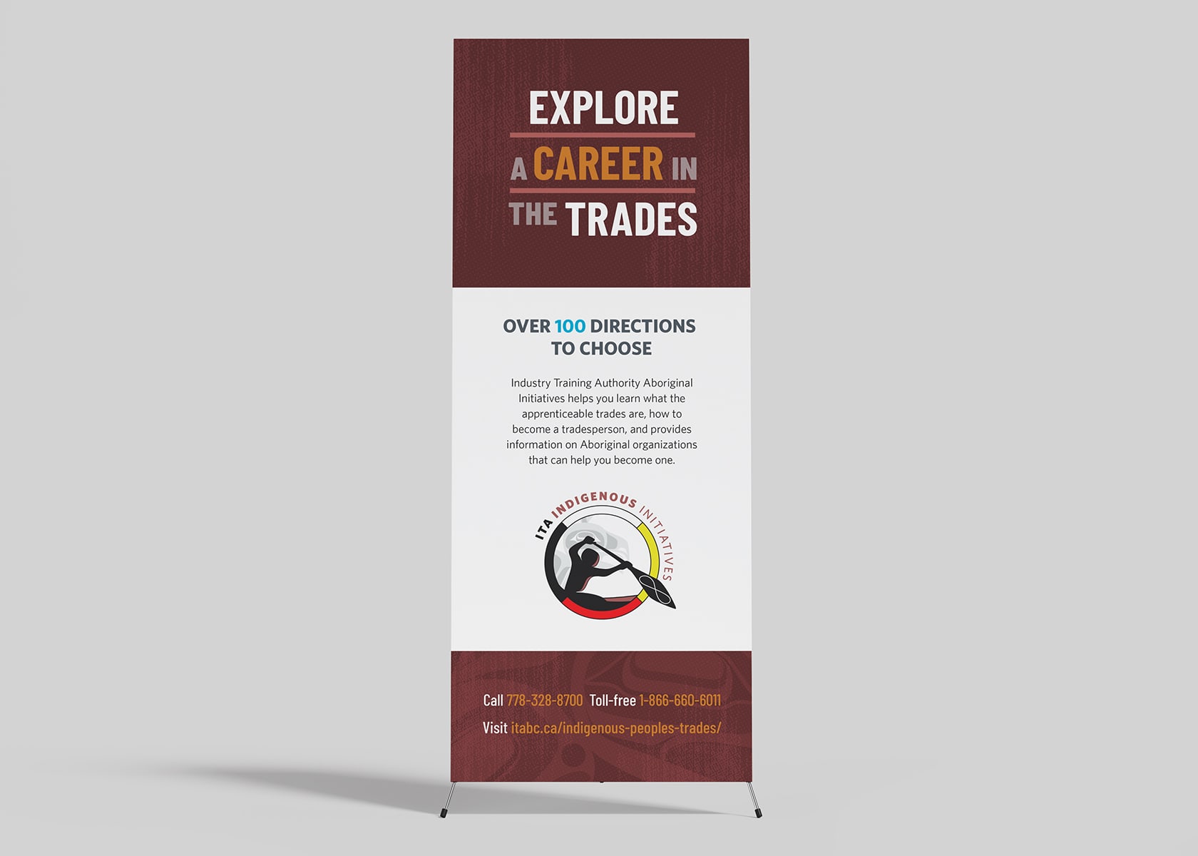
Industry Training Authority – Indigenous Initiatives pop-up tradeshow banner.
Results
Initial reactions to deliverables have been highly positive and some materials such as the Indigenous Inclusions Strategy have been approved by the ITA for distribution in the near future. We continue to work with the ITA on a long-term basis and anticipate that more work will be required for the ITA Indigenous Initiatives as this project progress.